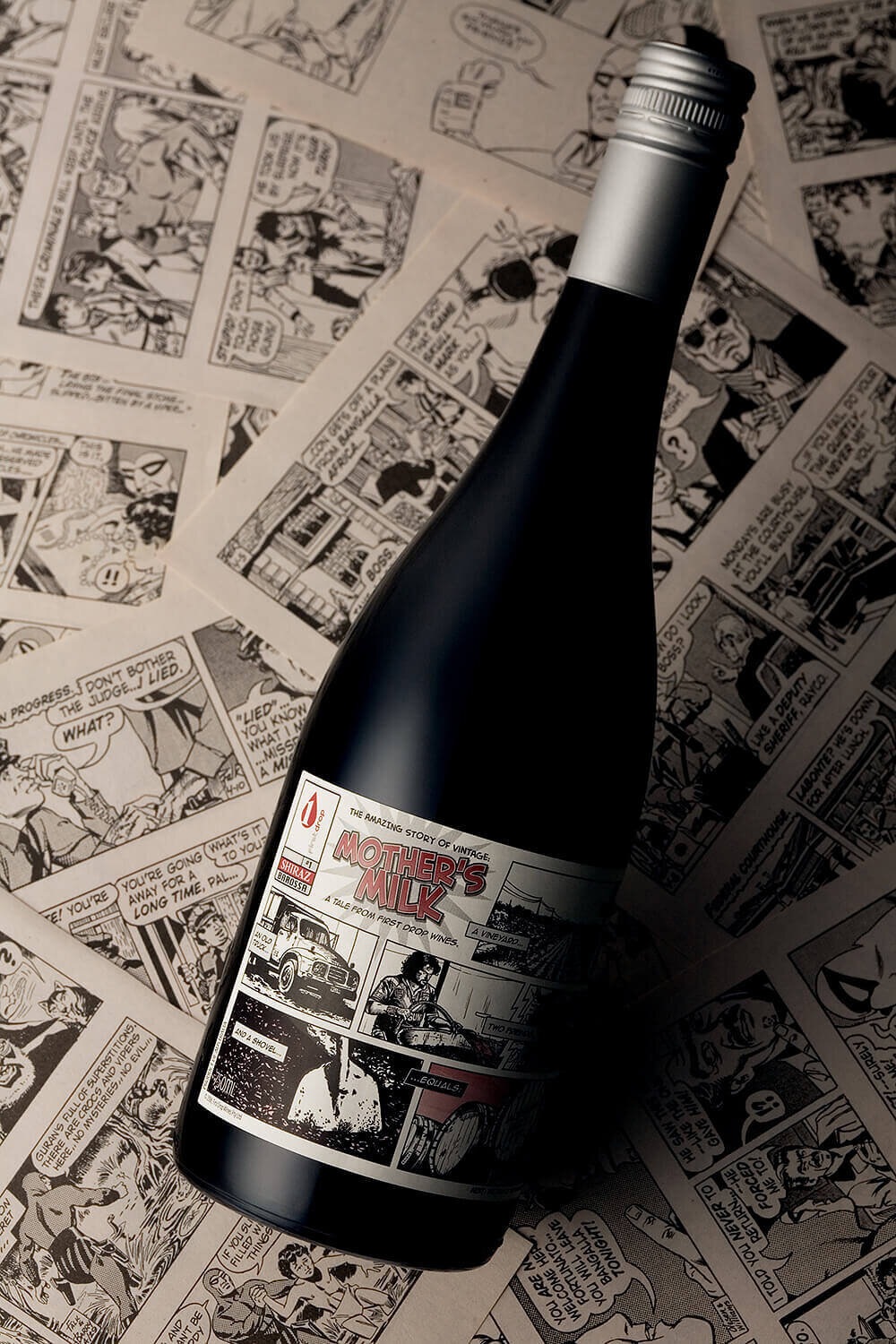
Mother’s Milk
Wine Packaging Design
Matt Gant and John Retsas, from First Drop Wines, handed over a box of seemingly random photos with the design brief, "Tell the story of our wine-making vintage through these pictures”.
After experimenting with a number of approaches and styles, we set on depicting the photos by way of hand-painted brush-and-ink comic illustrations, a nod to the ‘Phantom’ comics read in my youth. The label was designed to emulate a vintage comic layout with a restricted colour palette.
As the back label copy reads:
"The stories, incidents and characters mentioned in this publication are based on non-fiction. All characters featured and distinctive likenesses thereof are trademarks of First Drop Wines. Any similarities to persons living or dead is non-coincidental.”
And as for the seemingly random name that came with the brief? In the words of the winemakers, "It's so good, it drinks like Mother's Milk!”


“I was excited when I saw it. You absolutely nailed the Shiraz label! It captures everything that we’re after, even the blurb on the side label. It’s fantastic!”
– Matt Gant, First Drop Wines
Graphic Design
Illustration
Copy Writing
Print Management
CLIENT
First Drop Wines
Barossa Valley, South Australia
Photography © asbCreative


